If you didn’t know Paramount Global is set to merge with Skydance, then the logo included in their recent investor presentation would like to share an important update. Under its traditional mountain and stars, it shouts PARAMOUNT, using the all-caps styling and arched text of the Skydance logo instead of a more gently whispered Paramount.
Technology
- Home
- Technology
- News
Hopefully, this new PARAMOUNT logo won’t stick around for long
The Skydance-like version of Paramount’s logo from an investor presentation is not an upgrade from the traditional one — but it might not last.

Published 2 years ago on Jul 16th 2024, 7:00 pm
By Web Desk

It’s... not good. But, like the very bad Warner Bros. Discovery logo that appeared in 2021 when their merger was announced but disappeared by the time the deal closed a year later, it’s unlikely this is the final version of whatever redesign Paramount might cook up. If and when the deal gets done, the logo at that time probably won’t look like some poor shmoe had to jam out a quick synergistic symbol twenty minutes before an investor presentation.

:format(webp)/cdn.vox-cdn.com/uploads/chorus_asset/file/25530669/Paramount_Skydance.png)
And with any luck, also like the Warner Bros. Discovery logo that eventually popped up in 2022, it won’t be nearly as bad.
:format(webp)/cdn.vox-cdn.com/uploads/chorus_asset/file/25530731/WBD_together.png)
At least one hopes not.
I don’t know about you, but I’ve been seeing some version of Paramount’s logo in front of films for four decades. Movies that I bonded over with people I cherished or escaped into when life was too hard to deal with. Those images end up tied to that logo screen, then both to whatever sentimental experience I had watching them. It’s like visual comfort food.
:format(webp)/cdn.vox-cdn.com/uploads/chorus_asset/file/25530671/Paramount.png)

Adobe’s AI image generator can now be trained on your own art
- 2 hours ago

James Talarico’s “no meat” controversy explains a lot about America
- 9 hours ago

Fitbit’s AI health coach will soon be able to read your medical records
- 2 hours ago

Casio’s new $600 calculator is a work of art
- 2 hours ago

Here’s how Iran could become a “forever war”
- 9 hours ago

Tesla’s Full Self-Driving is on the cusp of a recall
- 2 hours ago

Maybe it’s time for The Bachelor franchise to end
- 9 hours ago
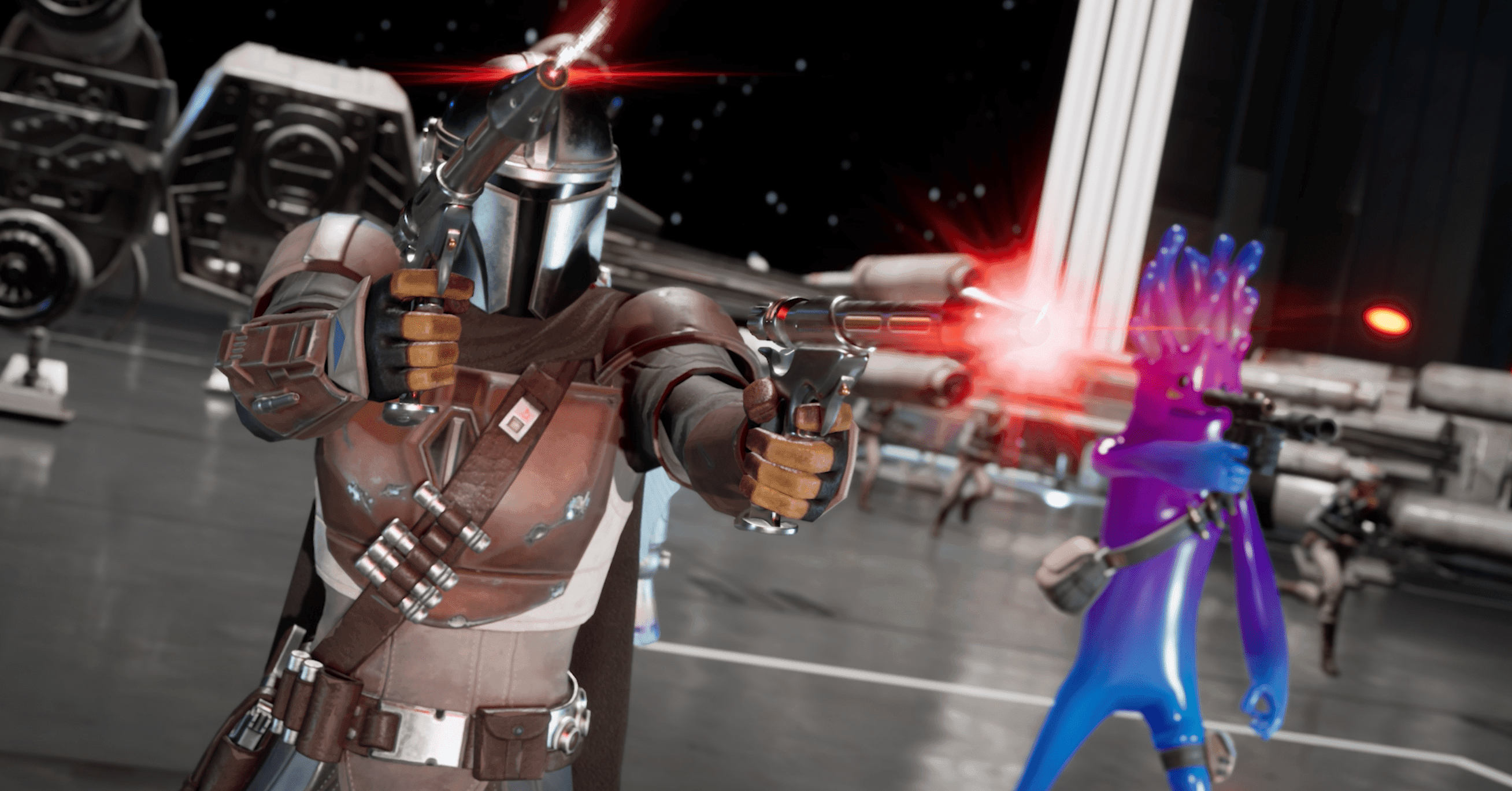
Epic and Disney now let Fortnite creators make Star Wars games
- 11 hours ago

The people dying in ICE custody
- 9 hours ago

Waymo hits 170 million miles while avoiding serious mayhem
- 2 hours ago

The pain from the Strait of Hormuz crisis will be felt far beyond the pump
- 9 hours ago

How to talk to your doctor about money
- 9 hours ago
You May Like

Trending


