Persona is one of the rare video game series where people actually talk about the menus. They’re functional, sure, but they’re also so incredibly stylish that you almost don’t mind constantly pausing to equip gear or heal your party. So when I had the chance to talk to longtime Persona director Katsura Hashino about his new game, Metaphor: ReFantazio, which continues this tradition of beautiful menus, I had to ask how they do it.
- Home
- Technology
- News
Persona director says making beautiful menus is ‘actually really annoying’
Katsura Hashino, director of games like Persona 5 and Metaphor: ReFantazio, explains why these RPGs have such beautiful and memorable menus.


The answer, as Hashino explains it, is simply a lot of work:
In general, the way most game developers make UI is very simple. That’s what we try to do as well — we try to keep things simple, practical, and usable. But maybe the reason that we’ve achieved both [functionality and beauty] is that we have unique designs that we make for each and every menu. This is actually really annoying to do. We have separate programs running for each of them as well. Whether it’s the shop menu or the main menu, when you open them up there’s a whole separate program running and a separate design that goes into making it. It takes a lot of time.
There are elements of craft and experience to it as well. While games like Persona 3 had stylish menus, there was a clear evolution in later games as the designs became more elaborate and animated. You can even see a difference between Persona 5 and Metaphor (see above).
Hashino says this is simply a matter of building off of previous work. “How we achieve both of them together is by the know-how that we built up over years,” he says. As an example, Persona 5’s menus feature a lot of angular elements, which initially created issues with legibility. “It was impossible to read at first,” Hashino says, “so we did lots of tweaking and adjusting so it became legible.”
You can explore Metaphor’s menus — along with the rest of the game — yourself when it launches on October 11th.

Iranian delegation led by Ghalibaf arrives in Islamabad for talks with US
- 6 گھنٹے قبل

US delegation led by JD Vance arrives in Islamabad for Iran talks
- 6 گھنٹے قبل

Google makes it easy to deepfake yourself
- 14 گھنٹے قبل
We have no idea if Iran can still build a bomb
- 12 گھنٹے قبل

Cousins: I shouldn't play if not Raiders' best QB
- 13 گھنٹے قبل

PM meets Iranian delegation; discusses regional and global peace situation and ongoing negotiations
- ایک گھنٹہ قبل

Democrats just locked down control of one of the most important courts in America
- 12 گھنٹے قبل
Ozempic just got cheap enough to change the world
- 12 گھنٹے قبل
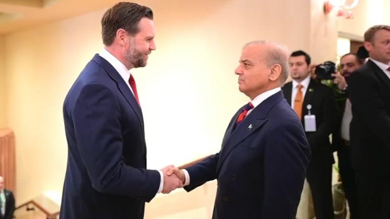
PM Shehbaz Sharif meets JD Vance, discusses bilateral ties and regional issues
- 4 گھنٹے قبل
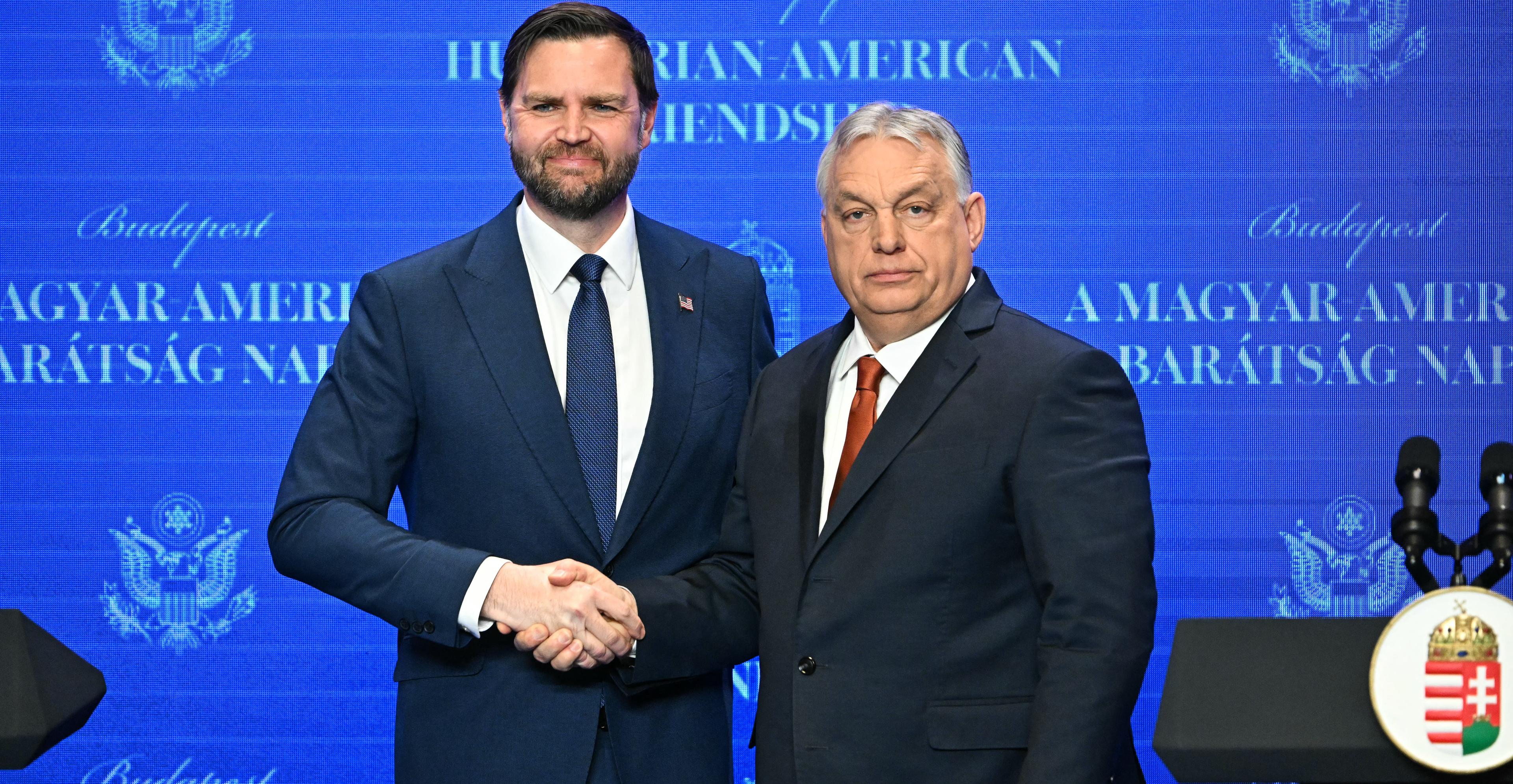
MAGA’s favorite strongman might be on the brink of defeat
- 12 گھنٹے قبل
Projecting NFL draft quarterback landing spots, from No. 1 to No. 215: New homes for nine passers
- 13 گھنٹے قبل

The soft TACO theory of Trump
- 12 گھنٹے قبل


